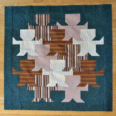
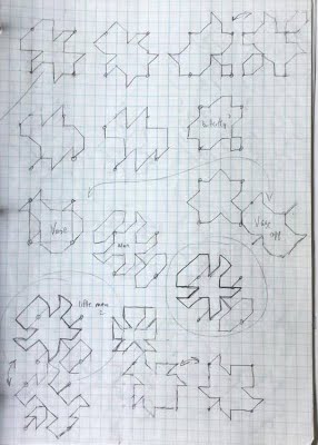
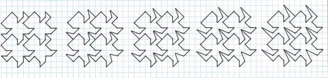
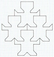
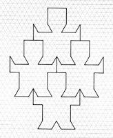
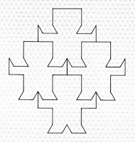
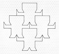
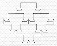
Under construction, subject to change, beginning 20 July 2018 Introduction This study is somewhat different from the usual practices of my own invention, as instead, it arises from correspondence with the Canadian quiltmaker Bart Braun. Our interaction beginning on 6 May 2018, who upon his asking for permission for one of my tilings to use for a quilt, then drew my attention to his quilt tessellating work on the online marketing site ‘Bonanza’ (of which previously I had not heard of). One work, in particular, titled ‘Little Men’, Fig. 1, caught my attention due to its inherent quality. Upon further correspondence, and a request as to concept sketches, Fig. 2, this was sent, and other related figures on the same page, both below. Fig. 1, Quilt and Fig. 2, Concept Sketches © Bart Braun As such, this is not strictly a single person study, and so matters of how best to attribute arise. Of course, in a sense, all this emanates from Braun, as without his work I simply would not have begun this. To what degree this can be considered as a single Braun or Bailey study or Braun-Bailey collaboration is a moot point. Certainly, there is no active mutual designing between us per se. More to the point, I build upon Braun’s work, and then expand, considerably so. Seemingly as ever, the study expanded more than anticipated. Note that a basic premise of tessellating art is that of striving for improvements upon the initial design, which is rarely ideal, complete as a finished work. This aspect is all too often neglected, with the artist content with an initial design that although may be broadly acceptable, and indeed good, loosely defined, could, with a little extra effort, possibly be improved upon. Such strivings should be accepted with equanimity, although of course to a practical degree. For instance, as concepts, spending an hour making the figure 1% better, yes; to spend days or weeks, no. The various methodologies shown below are perhaps a little excessive, but as the figure showed such promise I consider that the time involved was indeed justifiable. Note that the study, at least of the beginning, retains the 45° orientation of the figure for the sake of consistency, although at such an angle the figure is not posed in an ideal manner, as, obviously, he should be upright, of which later I then adopt. His Little Men was pleasing in many ways, of a broadly realistic humanoid figure, and of a minimalist nature, of few lines. Further, surprisingly, despite the simplicity, I was unaware of the figure (and annoyed at myself for not discovering this!). However, this is not to say the figure was wholly satisfactory in two main ways:
1. The head to body length ratio was lacking in reality. Ideally, the figure would be lengthened or the head made shorter, all things being equal.
2. The head and body width were of the same. Ideally, the figure would have the head made shorter, or the body made wider, all things being equal, to better reflect a real-life figure.
Ideally, both issues (shortcomings) would be addressed together. In short, although to a degree these aspects could be overlooked, if they can indeed be overcome than this would be a much-desired improvement. Consequently, with such a promising figure, I decided to have a look at the possibilities, with the premise of a systematic analysis. Indeed, the more exhaustive analysis finds some not previously found by Braun. Chapter 1 – Studies of Little Men Having discussed background matters I now discuss the study per se.
Chapter 1.1 - Analysis of the Little Men Figure
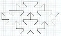
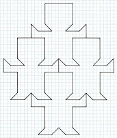
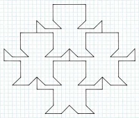
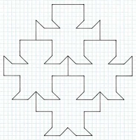
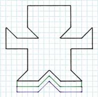
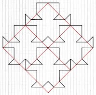
To begin the study, I show a single figure with colour coded symmetry analysis, Fig. 3. This can be described as of an underlying square, of a single line, reflected along the diagonal, and then translated left to right and top to bottom. A feature here is of a partial ‘shared line’ of a line segment. As can be seen, the resulting tile thus strictly ‘loses’ the original square vertices, and as a consequence, now requires the use of three colours for a map colouring.
Further to the analysis, it can be seen that the figure consists of six line elements, again, shown colour coded, Fig. 4. Beginning top left and then downwards, I use a rainbow colour order. The reason for this will become clear in the next section, where I discuss what I term as ‘flexing’.
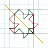 
Fig. 3, Fig. 4
Chapter 1.2 Flexing Premise
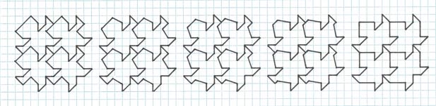
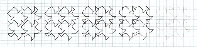
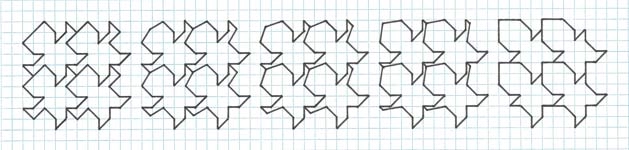
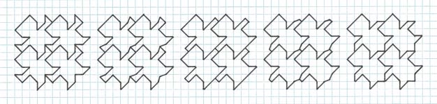
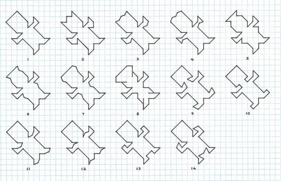
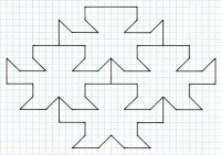
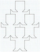
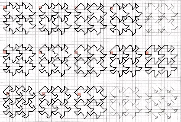
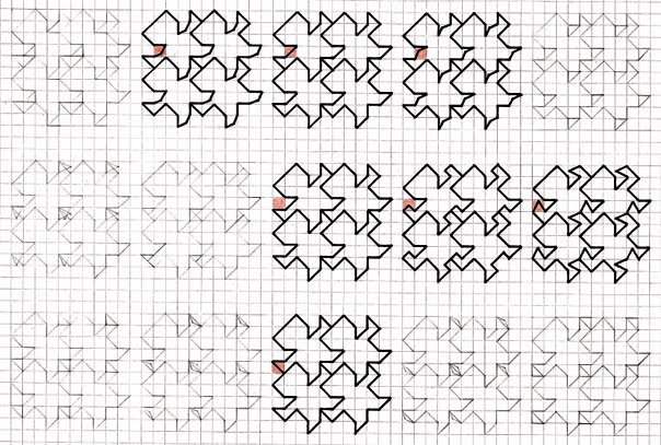
I now discuss what I term as ‘flexing’. This can be described as a variation of the figure, where the lines are flexed as according to grid intersections. As can be seen, this gives as series of like figures, but with subtle differences. Note that not all instances are permissible, as the flexes are on occasion inadmissible. Be that as it may, in this instance there are 14. This procedure is best seen rather than described; the diagrams should make clear what I am doing. Further, the appendix shows a colour coded instance, which is even clearer.
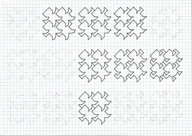
Upon initial ad hoc ‘variation’ studies, I eventually came to realise that each of these lines can be systematically ‘flexed’, inside and outside the figure, giving a series of five diagrams to a given concept. Given that there are six distinct lines of the figure, this then gives 6 x 5 = 30 diagrams (in theory, as not all of the procedures are admissible), Fig. 5. Note that I have progressed systematically, beginning at the top of the head, and progressively working downwards. The core value Little Men is in the centre strip each time, from which the flexes emanate. Proceeding on the basis of a picture is worth a thousand words, the diagrams should make this clear what I am doing. As can be seen, this procedure does not always result in a permissible tiling; some of the flexes result in entanglement. Indeed, only 14 (including Little Men) are permissible, with a further * in a state of semi-permissibility, where the line to some degree directly overlaps with an existing line, but with the figure being ‘non-standard’ in the context of the sequence. Whether this should be included in the set is a moot point. Be that as it may, I show these separately. For the sake of convenience and future reference, I show all these as a distinct, numbered set. An open question is to ‘validity’ as to new instances as to originality matters. Are these sufficiently different from the source Little Men to be considered as distinct entities in their own right (admittedly with a nod to the source), and not just some insignificant change of no consequence? One could argue in different ways. However, by and large, I think yes. Some contain new ideas. For instance, Row 2, No. 1 is suggestive of a girl with hair in a bun.
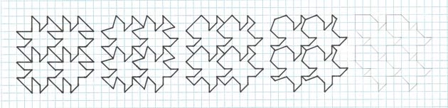
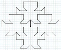
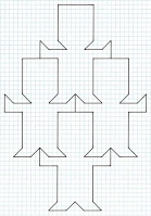
Chapter 1.3 Flexing along the long axis, from the centre and beginning of Little Men Continuing the flexing theme, it can be seen that the premise can also be applied to the figure in a different way, along the long axis (head to feet), instead of ‘localised’, as with Chapter 2.2, Fig. 6. As can be seen, there are two possibilities here, of five figures each, aside from the Little Men all new, thus giving a Set of 8. Again, I largely proceed on the basis of a picture is worth a thousand words, rather than a lengthy and potentially convoluted text. As can be seen, there are two possibilities here, of five figures each, aside from the Little Men all new, thus giving a Set of 8.
Fig. 6a Flexing along the long axis, from the centre of Little Men
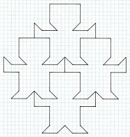
Fig. 6b Flexing along the long axis, from the beginning of Little Men Fig. 6c
Fig. 6d
ADD DIAGRAM Fig. 7
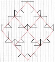
Now, given that the Set of 14 are all topologically the same as Little Men, just as this figure can be lengthened, so can the Set of 14, as below. However, although a Set of 14 is given, No. 8 can be seen to be strictly inadmissible, as lines ‘impinge’ upon the interior of the figure, although where these occur upon could arguably be removed, although then the figure is then not strictly true to the premise. Fig. 8 Hybrids
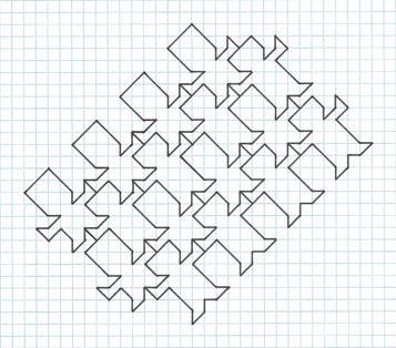
Aside from the single figures, and flexing/lengthening thereof, there are other possibilities, with what I term as ‘hybrids’, Fig. 9. This is described as a tiling of two (or more) tiles, of tiles based on different elements of Little Men that won’t tile singly, but will in conjunction with another (of the same premise). A single example is shown below. However, although of interest as a concept, I see little merit per se in this. The tiling simply shows what can be described as off-shoots of Little Men of different proportions. As such, there seems little merit aesthetically in this particular combination. To me, it can be described as being ‘clever’ for its own sake. Note that there are many hybrids possible, even including the Little Men figure itself, in association with the above (not shown). However, given that the concept is lacking aesthetically, I am broadly content to disregard such instances and simply outline the possibility. Fig. 9
Chapter 2 – Body Proportion Variations, of Lengthening, Shortening and Widening
Now, an open question is that of trying to improve upon the initial figure (i.e. Little Men) in terms of its proportions, with what I title as body proportion variations. As a concept, one could envisage a situation of various body proportions in which the figure is lengthened, shortened or widened. Note that these processes cannot be carried out in isolation, as by altering one part of the figure this affects another. To give an actual example, lengthening the head also lengthens the body (and vice versa). Any of these processes may be an advantage, neutral or disadvantage, although here, with a somewhat ‘compact’ figure, likely a lengthening would be advantageous. To this end, I now investigate, within a systematic premise, Figs. 10-15, with Variations 1-6. Simply stated, I investigate specific body parts, or regions. As can be seen, depending on circumstances, this leads to a situation where further continuation is inadmissible or can be continued to infinity, although where in such cases of the latter quickly become ridiculous in terms of ideal proportions of the figure, and so is then stopped after a few cycles. For each variation, I show in two parts first as a single figure, with colour-coded processes, and second by 2 x 2 tilings of the new figures thereof. Note that it can be seen that by lengthening/shortening/widening the Little Men figure the underlying square is typically, but not invariably, transformed into an underlying rhombus. An open question is to the integrity here. From a purist view, one can argue against this, as the defining underlying polygon is now lost. However, this seems a somewhat pedantic viewpoint, especially so as the figure does not directly lie on the square to begin with. Therefore, although all things being equal a square is preferred, there is nothing to say that this is the overriding value. As a broad statement, the rhombus variations have much of merit.
Now, an open question arises as to the merits of the new figures. Are these, as a simple statement, better or worse than the original? Prefacing this is the statement of an initial ‘good’ figure, with reservations as to head to body ratio. As a simple statement, arguably one is better, some are of a par, but most are inferior. The one possibly superior instance, Variation 6c, I now discuss in detail.
As a simple statement, one shortcoming of the Little Men figure is that the head and body are of the same width. Ideally, to better correspond with a real-life human figure, the figure should echo this, with a smaller head to a larger body. Variation 6c shows an instance where this is indeed possible. For purposes of reference, I will now title this a Bailey Little Men. This I now consider a decided advance, in that the figure is now more realistic, and is strictly to be preferred. Further, it still nonetheless retains the overall impression of Braun Little Men. And even further, this can be seen to be based upon an underlying square, and so is thus ‘higher’ than the generic rhombus instances. And again, in the interests of continuous searching for improvements, the same process of lengthening/shortening widening can be applied here as well. However, in this instance, the options are rather limited, as by changing the head/body the figure transposes back to the proportions of Braun Little Men.
Variation 1
Fig. 10a
Variation 2
Fig. 11a
Fig. 12a 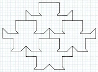 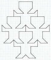 Fig. 12, 1-2
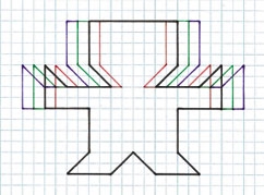
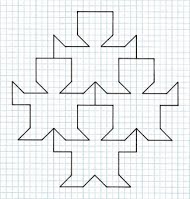 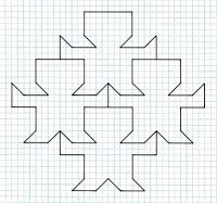 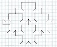 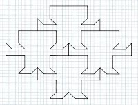 Fig. 14, 1-4. No. 1 is greatly favoured, with better proportions on the Braun source, now titled 'Bailey Little Men'.
Variation 6
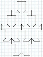 Fig. 15, 1-5. Nos. 3 and 4 are greatly favoured, with better proportions on the Braun source, now titled 'Bailey Little Men'.
Three grid overlays Showing how changing the figure, here by lengthening/shortening three instances, as in Variation 1, changes the original underlying square to a rhombus. No. 2 is of the original.
Other Grids (Isometric) Another possibility for variation is that of other grid papers, aside from squared paper. An obvious next choice is that of isometric paper. To what extent does this offer new possibilities? It will be seen that it is possible to draw a square tile on isometric vertices, and then, with additional lines recreate the Little Men figure. However, this is a pointless exercise, as all I am merely doing is recreating the 90° grid instance on isometric paper! More to the point is that of a ‘broad transfer’ of the figure, with new lines of 60°. The figure below shows one such instance; there are indeed others. Further, I also show that the same procedures as with the core values of the square-based tile can also be applied to this. An open question as to whether this is an improvement, in terms of originality, on the original square-based instance. Possibly, not, as it too closely resembles the original.
    1-4
Chapter 5 - Adding Interior Detail Upon having concerned myself solely with matters of the outline, which is the essence of a high-quality tessellation, in that, in short, the figure should be recognisable as in silhouette, I now address matters of interior detail. As such, although the figure can indeed stand alone as a silhouette, I consider that interior detail should be added. As detailed in my essays, this should be of a simplified nature, broadly as exemplified by Escher, but with concessions due to the geometric nature here, of a type that Escher strictly did not undertake. Upon examining the figure, this can be seen to be highly simple, of just a few geometric lines, at 45° and 90° to each other. As a broad statement, the interior detail should, for the sake of consistency, echo this simplified nature. But how simple? One could make a case for a cartoon-like appearance. But perhaps this is too simple. In short, a stylised amount of simple detail is judged correct, as loosely defined as it is. On the other hand, for instance, a highly detailed head, of a photorealistic appearance, would be inappropriate.
Concerning more specific aspects of the figure, the head causes problems. An open question as to whether the figure should be shown wearing a hat, to in effect disguise rigid lines. Would the head also be better drawn looking downwards? Should the figure have a discernible neck? What about the feet, which are somewhat ambiguous, which also serve as legs. Further, with the head to body ratio in mind, it could perhaps be better titled; Little Men suggest a full-grown adult, whereas Little Boys is perhaps a better title. Possibly, the gender title could be changed Little Women/Girls, to better reflect a more typical extravagant hairstyle. But there again, the figure is clearly clad in trousers, a more typical male attire. As is usual for Escher-like tessellation, compromises are in order. Likely, there is no one ideal outcome. Indeed, it is perfectly feasible, and appropriate, to have different versions, as a silhouette and interior detail, not to mention variations as detailed above. Indeed, at times the variations are a little overwhelming.
Appendix
Clarifications
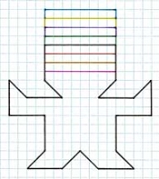
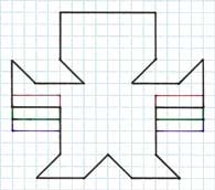
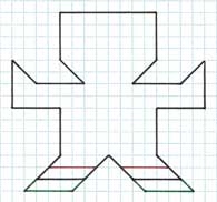
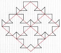
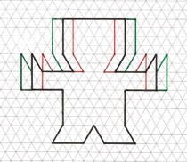
To better aid in understanding the procedures, below I show the flexing line premise, with a red coloured square for each of the six rows.
|